By Jeff Maisey
Let’s spell this out so there’s no confusion: Virginia Museum Of Contemporary Art.
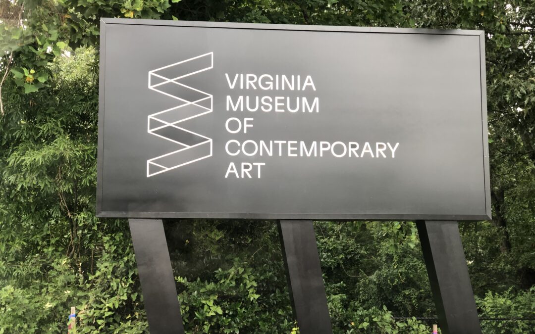
After more than a decade, the colorful MOCA logo with a splash of gray paint serving as the letter “o” has been replaced by a more slender design stacking the words Virginia Museum Of Contemporary Art in a rebranding campaign debuting in mid-July.
The new logo also features a Bauhaus-like zigzag of transparent walls meant to communicate the modern art museum’s exhibitions are ever-changing — no permanent collection gathering dust.
According to Gary Ryan, Virginia Museum Of Contemporary Art’s executive director, the cutting-edge visual art space had a brand awareness issue in that locals and visitors alike were confused as to whether MOCA was a museum, gallery, or something else all together. The new logo spells it out with no ambiguity.
The new branding coincides with the dynamic “Summer of Women” exhibition.
To learn more about the rebranding campaign, I caught up with Gary Ryan for the following interview.
Veer: When was the last time Virginia MOCA had a brand refresh?
Gary Ryan: Virginia MOCA became an accredited museum about 10 years ago so there was a name change. It went from the Contemporary Art Center of Virginia to the Virginia Museum of Contemporary Art, and that’s when the MOCA logo was created.
Veer: Why was a brand redesign desired?
GR: Its genesis was in some consumer research we had done. One of the things we struggled with was awareness. We did a bunch of consumer research with public stakeholders; those on the Board, in the city, in the community. We did focus groups. The main thing we realized was we have an awareness issue.
We kept hearing from the people who loved us was that we were a hidden gem. We had great art and programming but not many people knew about us.
There was confusion over whether we were an art center or a museum.
One thing we want to is unpack the fact that we are a museum. And that we are an accredited museum that has peers across the country that mount exhibitions of a national caliber.
Because of Covid, we launched a second website — VirtualVirginiaMoca.org — which was one of Brad’s (Tuggle) brainchild initiatives. Our current website was very transactional; it didn’t really allow us to engage our visitors with content…the web is really our front door.
Veer: In terms of the new logo design it reminds me of Toronto’s Museum of Contemporary Art, whose website is ironically Moca.ca. What was your process it developing your new logo?
GR: We’ve been at this for about a year. We went through a really extensive vetting process of finding a firm to work with. We talked to a lot of firms in looking at the positioning, the brand and the website. We landed on a firm by the name of Shavrick and Partners, which was briefly based in New York City and founded by David Shavrick who was the Chief Creative Director at Modem Media ages ago and doing digital work during the birth of the internet. We were connected to him through one of our board members.
David was the lead on the project. We had a strategist based in Brooklyn and Pennsylvania. We had a website designer from Detroit and a copywriter out of Portland, Oregon. We really had this distributed team.
They looked at between 75 and 100 websites. In addition to that they augmented the research we did by conducting additional interviews with stakeholders, board members and artists with whom we interact. It was the compilation of that as well as a lot of secondary research into web metrics that we got to a place where we wanted to be in the marketplace. It was really honing in on the idea that (1) we are a hidden gem, (2) people don’t understand we are a non-collecting museum. Being a non-collecting museum gives us the ability to reinvent. We really are committed to territorial voices and thought leadership at the cornerstone of what we do.
They felt we really had an opportunity to expand our reach by focusing on the people, art, and culture of the southeastern seaboard.
The overarching position we got to was that we are a museum that presented exhibitions with local relevance and national resonance. It was about the local conversation surrounding issues and topics being talked about across the country.
The other things they arrived at were they believe Virginia MOCA’s interests are particularly tied to Virginia Beach’s potential for arts-driven economic development that’s led to the revitalization of many US towns.
Veer: Part of museum branding comes in the form of merchandising. Have you tried the new logo in white on a black T-shirt? Will merchandise featuring the new logo be coordinated with the relaunch?
GR: We gave our most committed patrons a beach bag and a towel with the new logo on it.
I have to say, as you know, Covid was really hard on us financially. We’ve actually gotten rid of our museum store because museum stores and the managing of inventory doesn’t provide the support we need. So we’re going to step very carefully into the merchandise world. There’s no big plan for a massive merch in the near future.
Veer: The new exhibition provides an opportunity to educate visitors on the new branding. Is there a plan to welcome people into the museum and introduce them to the rebrand?
GR: That’s a great question. The firm we work with was charged with helping us with how to apply the new logo, the new typeface and brand identity across the board. So they were charged with designing the ads we’re launch with “Summer of Women” as well as the didactics in the exhibition. We have a mailer that’s going out that they’ve designed. The schwag we do have they designed. We do have stickers we’re handing out at festivals so we can get the logo out there.
Conceptually, the idea of the logo was that it was about shared spaces. It’s about intersections and finding shared spaces between the arts, the museum, and the community.
In terms of our positioning, local relevance and national resonance is really the overarching theme, but what we believe our mission to be is that we are an ever-change museum where neighbors, strangers, students, families, communities, cultures can explore our shared humanity.
It’s about shared spaces and coming together.


