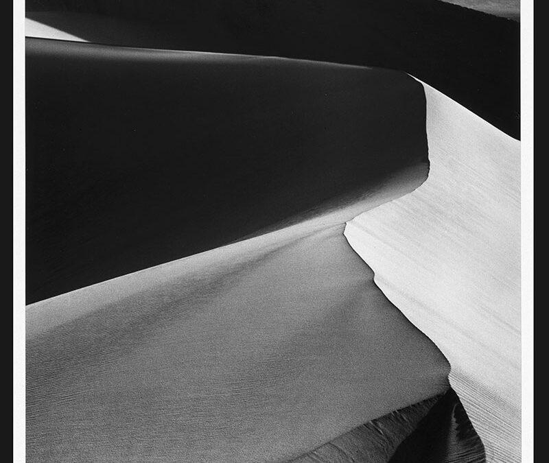
(Sand Dunes, Sunrise, Death Valley National Monument, California, 1948, printed 1974, Ansel Adams (American, 1902-1984), Virginia Museum of Fine Arts, Gift of Andrea Gray Stillman, 2018.584, © The Ansel Adams Publishing Rights Trust)
By Betsy DiJulio
Landscape photographer and environmental conservationist, Ansel Adams, scarcely needs an introduction. His household name is synonymous with, especially, iconic black-and-white images of the American West, though the range of his micro and macro subjects stretches from Yosemite National Park to the East Coast over the span of some fifty years prior to his death in 1984.
From the 1920s to the 1970s, Adams was a pioneering photographer, with clients as diverse as AT&T and the National Park Service. From Guggenheim Fellowships to major museum shows, magazine editing, book publishing, and the creation of photography departments at schools and museums, Adams was a ground-breaking synesthete who almost became a classical pianist.
Even people who know little about art, including photography, have likely heard of Adams’ highly technical Zone System for achieving monochromatic tonal range by controlling the exposure, negative development, and printing; that is “making” photos as opposed to “taking” them. The result is dazzling clarity or “pure” photography which stands in contrast to the “fuzzy wuzzy” school, Adams’s name for Pictorialism or photograph-as-painting. In response to their approach, he founded Group f/64 named after a view camera’s smallest f-stop which yields great depth of field and sharpness.
The clarity of Adams work is so crisp that it prompted me to ask Glen McClure, a national award-winning photographer friend based in Norfolk, why Adams’ images look so flat to me. His emphatic response was, “I would never call Adams’ photography flat!”
Then he tossed me a bone, saying, “Maybe you aren’t speaking to tonal values, but rather perspective?” Indeed. I explained that many had a flattened perspective, despite very deep vistas, that looked almost quilt-like in their contrasts of shapes, values, textures, and patterns. Ultimately, we agreed on the term “compressed perspective,” which, he explained, is achieved when “the subject is very far away and you use a longer focal length lens (telephoto).”
However you perceive Adams’ vistas and other work, you will likely appreciate how the photographs are installed at the Torggler. Organized by the Virginia Museum of Fine Arts and occupying more than half of the Anne Noland Edwards Gallery, the photographs are mounted on walls painted in a wide range of rich, but muted, earth tones—olive, turmeric, terracotta—which helps visitors digest the images in fluid subsets.
Immediately adjacent, Paper Light brings together selections of work—mostly photograms that seem to glow from within—from more than a decade of Claudia Smigrod’s creative output, especially her serial projects. If Adams can be considered a modernist, then Smigrod could arguably be considered a postmodernist, with these companion exhibitions serving to throw each other into high relief. Though postmodernism is a philosophical stance or ideology rather than a style, and is somewhat difficult to define—that’s part of the point—in general, the work is pluralistic, embraces ambiguity and relativism, is sometimes ironic, and defies easy labels.
Long captivated by the concept of the “empty dress”—an evocative visual trope for exploring the presence of absence, I found myself especially drawn to Smigrod’s approach to this metaphorical use of imagery. These seem to employ translucency, pattern, and form, along with memory and nostalgia, in especially effective ways, as do a series of transparent vessels.
But seemingly as significant as any individual photogram—characterized at times by puzzling formal and conceptual juxtapositions often constructed from the detritus of everyday life—are the installations of the projects. Variations on grids, largely symmetrical, the wall-mounted arrangements function almost like chapters in a book, i.e. thematic divisions or “vessels of story structure” that provide an organizing framework. But, for me, they share an irrefutable kinship with “curiosity cabinets” or rooms, dating from the 16th century, in which the collector’s eclectic and esoteric “curiosities” were arranged and displayed.
Known for maximizing every square inch of space for the exhibition of art by carving out micro-galleries, the Torggler is concurrently presenting Tidewater Untamed: Landscapes and Wildlife of Coastal Virginia, ArtCNU Faculty Exhibition, Alan Skees, and Camera Obscura, in which the most micro of the spaces has been converted into an actual camera obscura by virtue of a light-blocking curtain, dark walls, and a small circular hole or aperture cut into the wall.
WANT TO SEE?
Ansel Adams Compositions in Nature and Claudia Smigrod, Paper Light
Through March 5
Mary Torggler Fine Arts Center @ CNU


